Text style presets now support up to four breakpoint slots, so your type scale adapts gracefully from desktop down to the smallest phone.
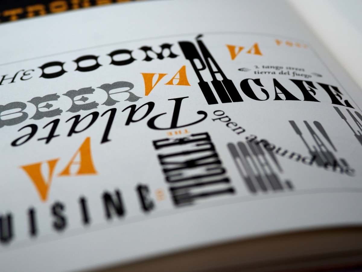
One type scale, every screen
Typographic consistency across breakpoints has always been one of the harder problems in Framer. The traditional approach — create a text style, then manually override fontSize on each breakpoint replica — worked, but it disconnected the override from the style definition. When the base style changed, the overrides didn’t follow. Finding all the divergent overrides across a large site was tedious and error-prone.
Text style presets now carry their own breakpoint slots. A Heading 1 preset can define 48px at default, 36px at medium, and 28px at small — all in one place. Any element using that preset inherits the responsive behavior automatically, across every page. Changing the scale means editing the preset once, not hunting down every heading on every breakpoint.
What’s supported and what’s not (yet)
Each preset supports up to five total breakpoint slots: a default plus up to four named replicas (large, medium, small, extraSmall). The available properties per slot are fontSize, letterSpacing, lineHeight, paragraphSpacing, and minWidth. Color, font family, and text transform are not yet breakpoint-aware at the preset level — those still require per-node overrides at the breakpoint. We’re planning to extend the system to cover those properties in a future release.

Join thousands who stopped leaving their health to chance and let Vitalpeak's AI show them exactly what their body is capable of.
Cancel Anytime
14-Day Free Trial
5 Minute Setup